Background
Free Chapel is a multi-site megachurch with campuses currently in Georgia, California, and South Carolina. Brewster and Crocker Architects (BCA), along with our great consulting team, has designed and/or renovated all their campuses providing complete Architecture, Project Management, Interior Design, and Engineering services.
When the time finally came to renovate the 88,000 sf OC facility, Free Chapel called on BCA to work with them again. The building was originally built in the early 1970’s as a 2-story office and laboratory building. Back then the surrounding areas were very rural and industrial. Today, the area has changed into a very modern urban retail district with a lot of new developments surrounding the FCOC campus.
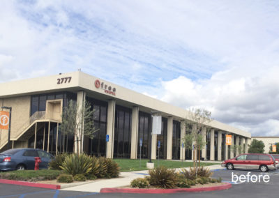
On the exterior, the original building was to say the least – very basic. There were 2 identifying factors that said it was a church – a very large cross, that has become somewhat of a landmark in the community, and a sign – other than those, it was a very non-distinctive building.
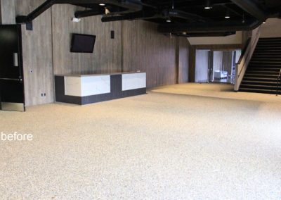
On the interior, the building was functional but basic. Since it was originally designed as an office building, it has a grid pattern of columns throughout. You entered the building into a stale dark lobby with a set of stairs that led up to the 1,200-seat auditorium. There were doors and dark corridors all over the place creating bottle necks of traffic congestion for the 3 services on Sundays. Other than the recently renovated youth and restrooms areas, the building felt dated.
One of the biggest challenges we faced was in the auditorium – bad site lines due to all the columns. The column layout created major site line and stage design issues in the low-ceiling 1,200 seat room and the feel was very basic and did not reflect Free Chapel. Over the years since FC purchased the building, the church had investigated removing some of the columns a few times previously, but due to cost and design issues they never proceeded.
Design Objective and Challenges
The church’s design objectives with this project were:
– Exterior Renovation and makeover that reflected the context of the surrounding developments.
– A vibrant welcome lobby and common spaces.
– Open circulation that reduced congestion.
– Auditorium renovation with removal of some columns for better site lines and a new stage.
– Outdoor Space that is usable and not just a transition area from the car to building doors.
As we began discussing concepts for each of these with the church and what the building and area would look and feel like, the biggest design challenges were:
– Removing columns in the auditorium of a 40-year-old building in an earthquake zone.
– Updating and modernizing the building’s exterior with bold contemporary materials and finishes.
– Opening-up small confined fire corridors into very open inviting areas and maintaining Life and Fire safety codes.
– What do we do with a big steel cross?
– Designing effective usable outdoor space within a limited area sandwiched in between a building and a parking lot.
The Solutions
Interior
Auditorium –
Our team was able to come up with a design and structural engineering approach that was able to achieve one of the biggest challenges they had always wanted to do – remove some columns – open-up some site lines, increase seating, and build a new stage that has the feel and character that reflects Free Chapel.
By removing some columns, we designed a triangular shaped stage which extends out into the room creating a 180-degree seating design for a warm intimate feel with great site lines, a large enough stage to provide an area the church needed without being cramped, and increased seating capacity to over 1,200.
Main Entry Lobby and other areas –
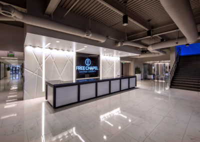
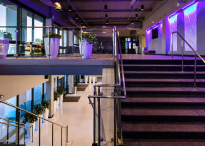
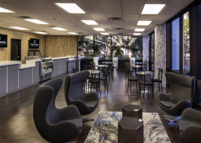
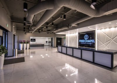
The first notable change when you enter the building is a vibrant open welcome area. By using a creative design approach, we were able to open-up the lobby and corridors and create a vibrant feel that eliminated many of the corridors and doors by using concealed sliding fire doors. The focal point of the lobby is a new welcome center and video wall. We also opened-up the stairs to the upper level auditorium with glass railings, added a new children’s check-in that is open and easy to access, enhanced security features without sacrificing design, renovated the adjacent connections lounge which allows guests to grab a cup of coffee and snack, and added additional doors to the outside to increase traffic flow. All these areas use vibrant finishes and light colors, marble tile, 3D accent wall panels lit with color changing LED lighting, bright colors, glass, and new LED lighting throughout. The result was a completely new environment.
Exterior
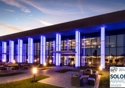
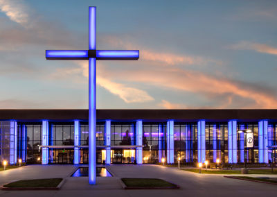
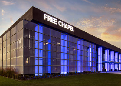
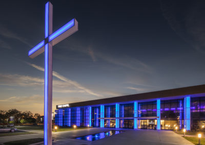
The exterior renovation was radical yet simple. It included wrapping the massive 2-story columns and 26-foot-tall cross with color changing back-lit acrylic panels, a metal accent screen wall, canopies over the entrances, changing the building color, new window tinting and frame colors, adding a water feature and outdoor baptistry, outdoor connection spaces with lounge seating and fire pits, new parking lot lighting, and new signage.
Final Results
The one word we here from everyone who has seen the transition to before and after is – WOW!
